· By John Frazier
Spartan Spotlight: Dan Black, Landland
The Spartan Profile series returns with an interview with Landland designer Dan Black, the creative force behind The Darling Fire’s haunting album artwork. Below Dan discusses sources of inspiration, the design process, and creating a narrative world within and across his artwork. Also featured is an exclusive playlist curated by Black — enjoy!
How did you, The Darling Fire and Spartan connect?
Jolie from The Darling Fire reached out and kinda explained what was going on and what they needed. I'm really bad at doing the follow-up "How'd you find out about Landland?" thing, so I don't think I ever really asked...I'd worked on art for The Pauses' newest LP about a year ago, and they're another Florida band that recorded with J. Robbins, so I suspect that there might have been some crossover somewhere in there and my name might've come up, but I actually don't know for sure, haha.
Can you talk about your career path as a designer? What led you to Landland and music-centric design projects?
I've been working with my friend Jes as Landland since 2007, mostly making posters for touring bands like Arcade Fire and Phish and all points between...before that, I had a brief period of working for Target as a graphic designer and doing screenprinting and poster design as an afterhours hobby. Eventually, the hobby overtook the day job, and we've just been steadily building out our screenprinting studio piece-by-piece and making a TON of work ever since. The first few posters we made were for our own bands and bands that our friends were in, and that slowly and gradually led us to working for bands we didn't know, and then larger and larger bands, and expanding that to film posters and all sorts of self-initiated work. There's a lot of record packaging design peppered in there, but the posters and other work like that usually keeps us too busy to do record packaging as often as I'd like.
Talk about the creative direction for the Dark Celebration artwork — what were you hoping to accomplish or communicate?
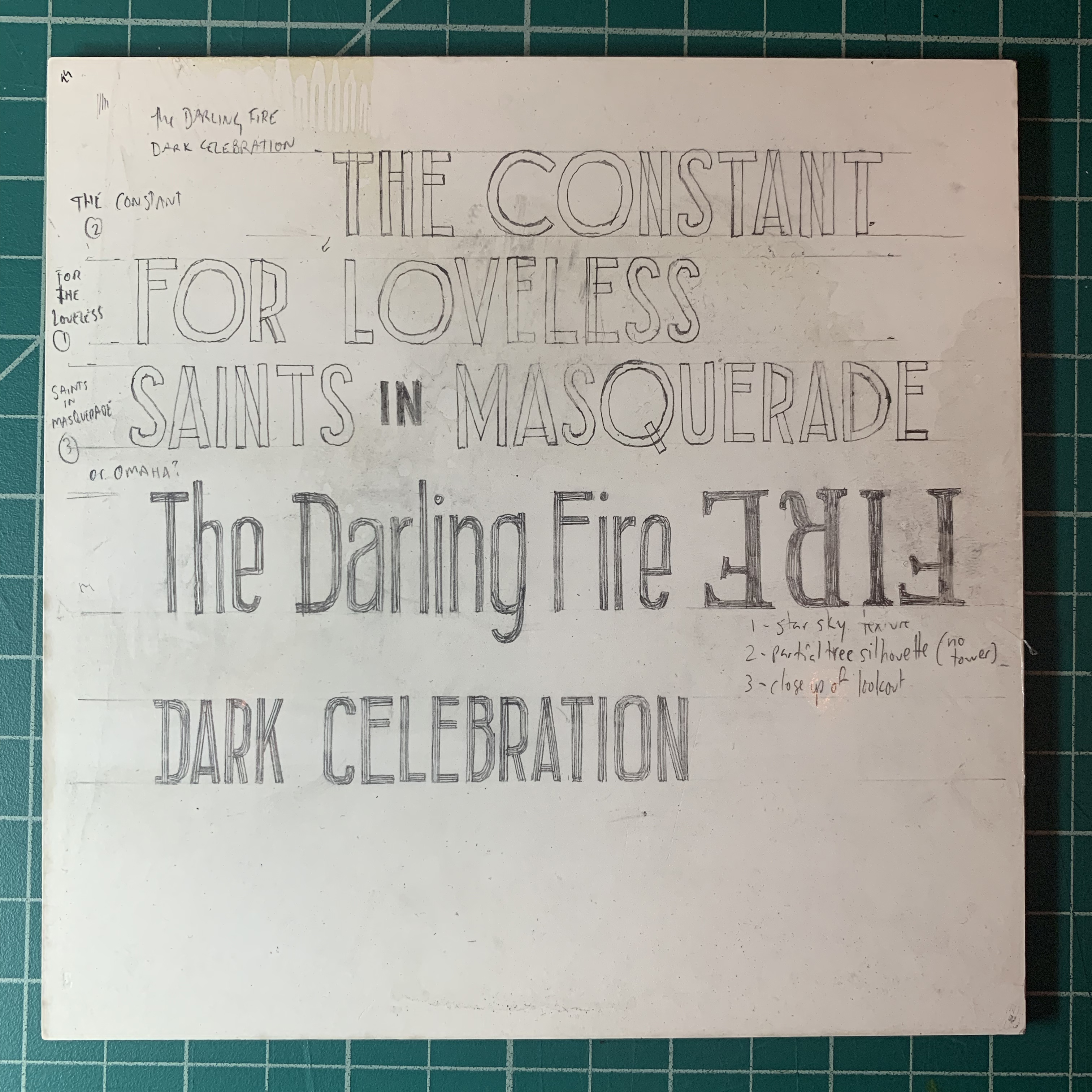
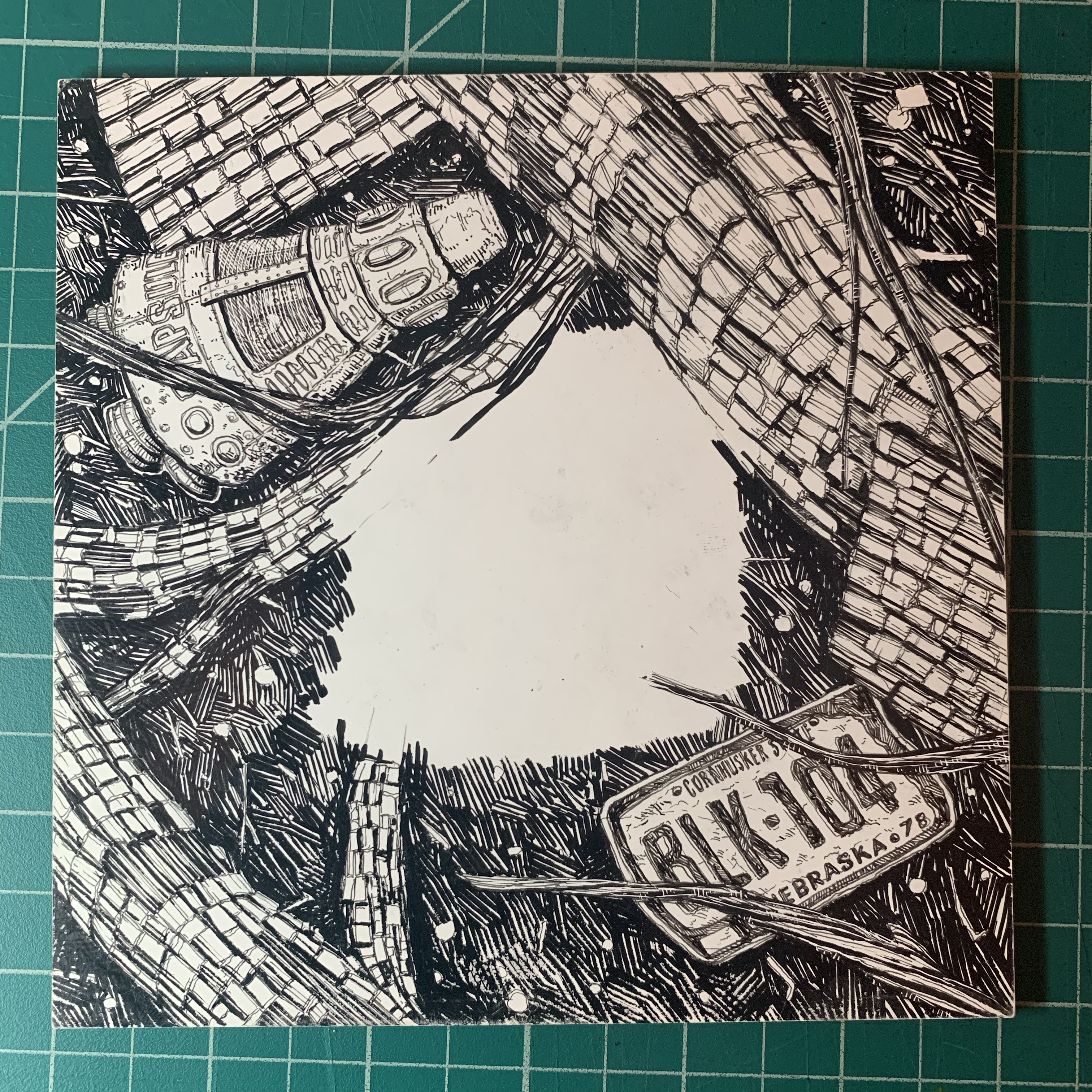
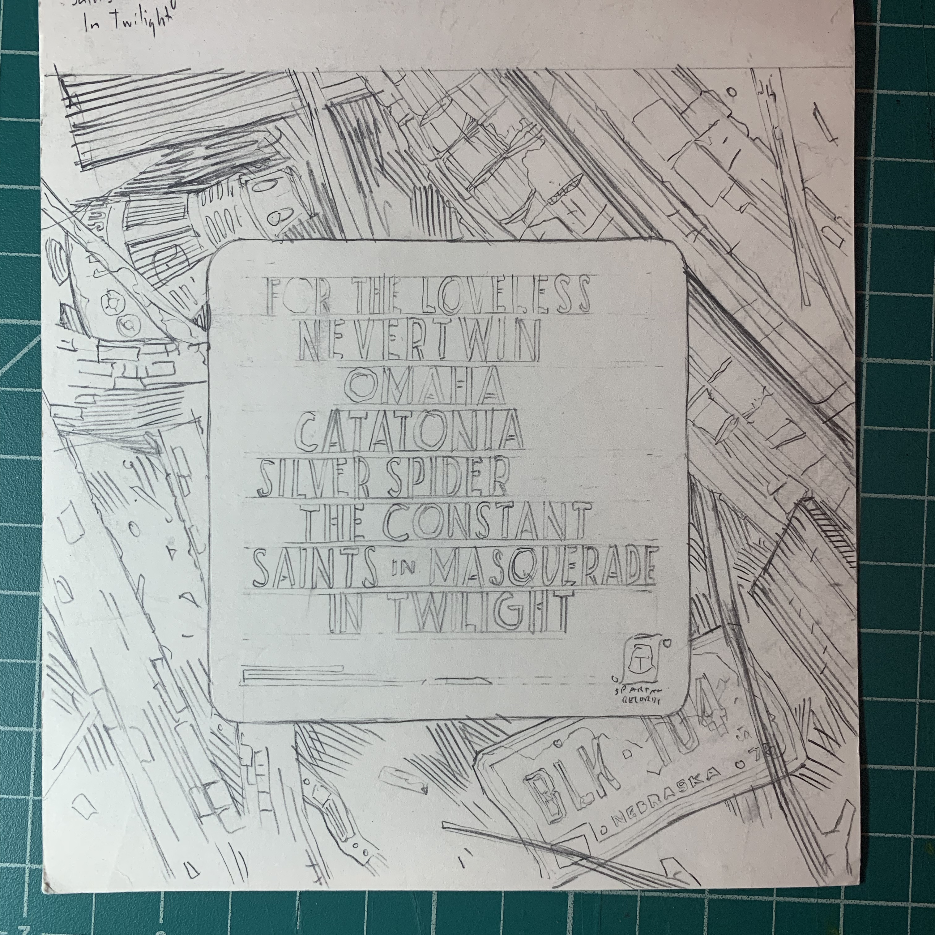
There was a lot of back and forth leading up to actually starting to design the art for the LP; I usually like to ask a lot of questions about which parts of my work a band is gravitating toward, or what they were looking at when they decided to get in touch with me. We talked a little bit about some past posters I'd made that gave a point of reference for the kind of illustration they were hoping for, and Jolie sent over a lot of materials to give me the general feel of the album. They were really on the ball with everything, so we were actually talking about what the album would look like before it was recorded. Jolie sent over a list of adjectives to give a sense of the mood, and then her lyrics of course. I don't really like to rely on lyrics directly, but it definitely helps to suss out the themes that run through an album and the kind of atmosphere they're hoping to create. Somewhere in all of that, there was some direction that maybe it should be dark and show some sort of forest fire scene. I sketched up an idea that included an old fire watchtower and an indirect hint at fire off in the distance, and we just pushed on from there.

How would you describe your creative process?
That back and forth I mentioned is a lot of how it starts...most of the work I do is for someone else's band or project, so it's important to get a feel for what works for what they're doing. The other side of that coin, is that I'm also always pretty conscious of developing a body of work that feels relatively cohesive and a visual vocabulary that's almost like world-building in a way; even though everything is dealt with on an individual basis, it's not crazy to imagine that the watchtower from the cover of this could exist just down the road from the abandoned amusement parks in some of my poster work, or the boarded-up gas station that shows up on a Jeremy Enigk poster. There's always a real push to satisfy the design needs of whatever I'm working on while also creating a thing that fits within the rest of my lexicon.
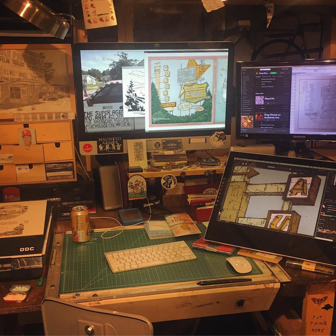
As far as the actual execution, I draw everything by hand; first sketching it out in pencil where I can obsess over perspective lines and compositional details, and then once all of that is pinned down, I'll usually transfer that layout onto a piece of clayboard where I can dig into all of the fine detail work. Clayboard enables me to fill dark areas with ink (like most traditional illustration), but also to carve out light areas and create white space where I've already laid ink down. It's a really versatile way for me to work, and opens up a whole realm of technical possibilities that I didn't have back when I mostly drew on paper. The illustration is definitely the most labor-intensive part of the whole process, so I really like to make sure that the groundwork is laid and everyone's on board with what I'm doing before I launch into that. After that's finished, I'll go through and add color where necessary...that usually happens digitally, but everything that you see that looks like illustration is all always done analog.
How does music inspire your design work?
When I'm working on posters for a specific band, I try to make a thing that isn't derivative of the visual communication they're already doing (album art, merchandise, nouns in their lyrics or song titles, etc), but rather a thing that could exist within the world they've created. It's a step removed, but not wildly disconnected, if that makes sense. Album art is a whole other thing, where I really want to communicate with the band and make sure we're hitting all the points we can as far as what they want. Moreso than a poster, album art lives with the band for a lot longer; it becomes a part of their permanent discography, and when it's done well, it can help shape a person's listening experience when they sit down to listen to the album. I'm a little bit old, so I really have a huge soft spot for the idea of getting an album, putting it on, and having nice packaging to pore over and dig into as an accompaniment of the music. Thinking about how a person is going to handle the jacket and all of the parts of the record, and how they move through the packaging is one of the most fun things about designing this sort of thing. Like, I used to sit there and just study the thanks lists in these things, and the bands they'd mention in there were like little clues as to what else might be cool out there. A cookie crumb trail of nerd shit to build a cool experience around an album. With the jacket for "Dark Celebration," one thing I wanted to try to do was create a path where people would be pulled in by the front cover, and then moving to the back would work as sorta zooming in to the charred wood and bits of the aftermath of the fire that's happening off in the distance. The idea of taking in an overall scene and then spending time with it to notice the details around you.
A lot of Landland’s work seems centered around animals and the natural world — any particular reason?
That's definitely more Jes's thing than mine...I think her narrative tendencies are bit stronger than mine are, or rather, I go a much more subdued route with a lot of my work, where most of the narrative is in the implication of past lives in these places I'm drawing. It's all little bits of evidence that people have been around at some point, but not really holding anyone's hand to spell out exactly what's going on or why they've left. Jes is much better at creating scenes where you're seeing action taking place...schools of fish moving past weird islands, or birds perched on ruins of whatever thing's all caved in by something that happened long ago. I think there's some amount of crossover between her world-building and mine, but a lot of that can be chalked up to the fact that we see everything the other one is working on all time, and part of why we're best buds and make sense working together is because we're attracted to a lot of similar imagery. I don't think I could do this stuff without her, or at least it wouldn't be nearly as fun or interesting.
What else inspires you as an artist / designer?
I try to build a lot of time in my life to travel a lot within the U.S., and am constantly wandering around in places where a lot of people don't usually go (or haven't in so many years), whether that's old logging roads up in the Pacific Northwest, or out in the old uranium mining territory in the canyons of Southern Utah. You end up in these places that used to have great utility to people, where they built towns and roads, and then completely left the whole thing to be swallowed up by nature and returned to the earth. It's really interesting to see the bits of evidence of the past and build vague narratives around it. I've also always looked at old signage and the way messaging works in specific environments...I've been into signs and old billboards and things like that since way before I could read—with almost an embarrassing level of obsession—and love integrating that interest into the work that I'm making for bands and things like that.
Who are some artists (musicians, visuals artists, writers, etc.) who you really admire? What about their work do you connect with?
Phil Elverum of Mount Eerie, for both his music and his visual/design work. It's all perfect. I share a studio with the Minnesota members of the Vacvvm (Aaron Horkey, Mike Sutfin, Brandon Holt & Mitch Putnam) and those guys are a constant inspiration...they push me to constantly try to step up my technical skills, and they're all great to be around. Ryan Duggan, Mike Mitchell, Aaron Draplin, Jeremy Enigk, Tim Kinsella, Owen Ashworth, Jay Ryan, Sonnenzimmer, Daniel Higgs, Marcel Dzama, David Shrigley, a million others. There's a bunch of people I look up to a lot, and a lot of them are friends, which I feel really lucky for. Tons of poster artists...there's an excellent community of people doing work that are constantly refreshing the medium, and it's cool to see that happening in real time.
What should people know about St. Paul, MN?
I'm actually still learning about St. Paul...I recently moved back here after about five years of living in Chicago, but when I was here before, I was mostly a Minneapolis person. There's kind of a big divide between the two places, or at least there was back then, where St. Paul was always sorta the sleepier and more residential city, and Minneapolis is where you go out and do things. This entire place is littered with references from The Hold Steady & Lifter Puller songs, which is kinda cute, but only important to probably a handful of people...super mundane landmarks like a specific Party City in a strip mall, and intersections that get name-checked as places where some desperate things happened that are actually just places where they put an Aldi or whatever. It's got a good mythology to it, and plenty of rock history. The day Prince died shut this entire place down and turned it into a metro-area-wide memorial dance party. The harsh winters scare everyone away, but it's secretly incredible here.
What else should folks know about you and Landland?
We're constantly working on things...so much poster work all the time, and art prints and weirdo little notebooks and pins and things. We've done a few collaborations with Field Notes, which was really some bucket list stuff to be involved with. I've also started a Landland record label as a sort of hobby thing to give myself more projects, haha...we've released a bunch of records by Slow Mass (an incredible post-hardcore band from Chicago that tours constantly), Chris Brokaw & Geoff Farina (from Codeine & Karate, respectively), Birthmark (Nate Kinsella of American Football), Tim Kinsella/Joan of Arc, and we're slowly getting ready to do vinyl reissues of all of Jes' band Best Friends Forever's discography, which I'm pretty psyched about. We use Instagram more than anything (we have separate accounts: @landlandcolportage & @_jseamans), but there's also a secret Facebook group that's kinda huge and a really good place to find out about our stuff as it's happening (search for "Landland Appreciation Society" on FB). We also travel around to SXSW and other music festivals, where we set up a booth and stand in front of the things we've made, talking about the things and selling them to people. The biggest takeaway is that we stay really busy, haha. I don't really know how to do it any other way.
Thanks for stopping by. Makes sure you check out Landland’s site to see more of Dan’s work (pick up a print or two while you’re there!), and buckle up for The Darling Fire’s debut record Dark Celebration, which is out everywhere now!